These are the most recent updates from my weblog Tom 7 Radar, specifically those in the Pac Tom Category. You could subscribe to the RSS feed if you demand web-lifestyle integration.
The Pac Tom documentary!
(28 Dec 2022)
It is done! I finished the Pac Tom project to run the length of every street in Pittsburgh in October, and (yes it took months) also this video documenting the project and finale:

How I ran the length of every street in Pittsburgh: PAC TOM
The Pac Tom site now has the final data, but the video is the definitive way to see it!
I added the downloadable Soundtrack for completionists. I was horrified to find, when watching this video with some friends after I uploaded, that I had accidentally muted one of the audio tracks for the "final" version. You can rectify this by playing "Street (Trap Remix)" at exactly 11:58.
Pac Tom article
(30 Nov 2013)
Local fame is mine! Here's a writeup of the Pac Tom project in the Pittsburgh Post-Gazette: The man who will run all of Pittsburgh.
Pac Tom is coming along pretty well. I've long since finished the whole of Continental Pittsburgh (area between the two rivers) and the South is all done except for a single run that I will probably use to finish up on Mt. Washington. I've taken a big chunk out of the North Side, with several of the most distant neighborhoods completely done. I've slowed down a bit, partly because I got out of shape after a tough year, but mostly because I'm a little afraid of finishing now! I probably only have about 10 trips left, and after that I'm not sure what I'll do with myself. (I mean my feet. I have loads of projects as usual.)
Pac Tom is coming along pretty well. I've long since finished the whole of Continental Pittsburgh (area between the two rivers) and the South is all done except for a single run that I will probably use to finish up on Mt. Washington. I've taken a big chunk out of the North Side, with several of the most distant neighborhoods completely done. I've slowed down a bit, partly because I got out of shape after a tough year, but mostly because I'm a little afraid of finishing now! I probably only have about 10 trips left, and after that I'm not sure what I'll do with myself. (I mean my feet. I have loads of projects as usual.)
Needless advancements in shoe tying
(29 Jul 2012)
Well, just one advancement, which is this:
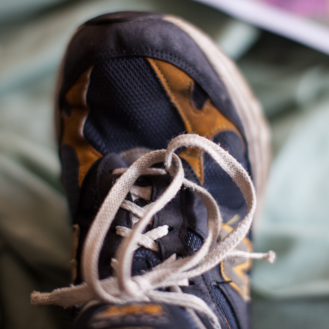
It may not surprise you to know that I have spent way more than an average amount time thinking about how best to tie shoes (knots were a specialty of mine in Boy Scouts and during my grad school megaprocrastination phase I even staged a bunch of photographs of them for Wikipedia), but it may surprise you that when this vision first struck me I was at first unsure that it was even possible. (Somewhere, someone with basic geometric sense chuckles, the kind of dismissive reflex laugh that is transformed into an awkward fake cough when he realizes from my expression oh, you weren't joking.) Of course pretty much any knot shape you can imagine is possible with both ends free. This one isn't even that mechanically difficult to carry out, though if you are like me then the shoe knots are stored 100% in muscle memory, not like even accessible to your conscious mind, like when you can't remember the particulars of your password's capitalization or the fingering of the Csus4 chord without actually doing it, maybe on an invisible keyboard or guitar. So far, the double-knot version eludes my attempts at dexterity. But I don't like to give up!
I was just about to go out running to work on my Pac Tom project which has not been getting much attention this year for a variety of reasons. Right as I'm about to leave the house with everything ready (as much as a like running for its simplicity, there's the preparatory food and liquids and coffee and ibuprofen, sunscreen which by the way is a real walnut with a beard and general body hair, plus I have this super old Baby Magic brand old dried sunscreen that I found on Ryan's porch and appears to contain an infinite amount of superdense titanium white oil paint, which is the suncreen that I have been using for years because it's not like I'm going to throw this perfectly good old dried immiscible paste out, even though Ryan tells me that it probably contains poison because it dates from pre-FDA era wild West style chemistry times, and then the shoe tying which becomes a thought excursion, and since I just got a new computer I need to install all the mapping stuff on it and transfer it over from the old one, etc.) I realize that my GPS watch, basically the only piece of non-negotiable equipment other than the left and right feet, is out of batteries because of the ill-designed chargey clasp whose design hostility defies explanation other than schadenfreude. That's what's charging now and the reason I'm taking the time to go on and on, instead of actually doing the running, which I'd prefer to do, not just because I feel suddenly stricken with exaggeration logorrhea, though I guess obviously that does happen. We're at 53%. I'm talking about the Garmin Forerunner 310XT here, in case someone on the design team some day scours the internet to find some schadenfodder. The chargey clasp thing is a springy clamp, that you clamp around one side of the watch like a snake face. Its lower teeth are spring-loaded pins that carry the electricity juice into two little charge dots on the underside of the watch. Boy does this not work well! And I'm not talking about like works-at-first NES-cartridge contact malfunction, or even like BART ticket machine designed-by-an-alien-race stuff, more like a carnival game that is designed to trick you to keep putting quarters in. The standard way for this to go wrong is that you put the snake face on, and the teeth go into the little holes on the bottom, but the pins aren't actually contacting the charging nipples because inside the holes there are both metal contact nipples (useful) and waterproof insulating plastic areolae (useless). What is this bullshit?
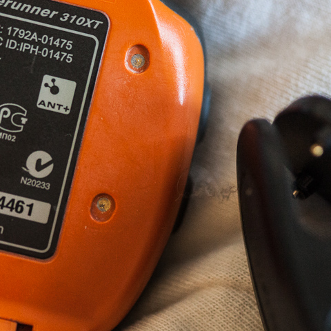
So obviously if either charging tooth is on areola, then it doesn't charge. Even worse, since these are recessed holes and on the side of the watch exposed to skin and trapped corrosive salty sweat and Baby Magic, what little contact area there is tends to get covered up by trapped dried particles or invisible dielectric or electrochemical deposition since these are after all battery contacts. So you learn pretty quickly that when you get the snake face on, you have to jiggle it around to get actual charge contact (you obviously can't actually see in there as you're doing it so it's a bit more like the telemetric feel of lockpicking). You can see on the screen whether it's charging, thank goodness. But this arrangement is pretty unstable, so when you put it down on your computer or whatever, you have to be pretty careful to place it in such a way that the mere act of placing, or any further vibration, like from any dubstep within a few blocks radius, during the time from now until you decide to go on a run, doesn't dislodge the teeth. Which is what happened today. Now here is the most devious betrayal. If the watch becomes dislodged while charging, it reverts to the previous state (on or off). If the watch was turned on when you plugged it in, it turns back on, and then searches really hard for GPS signal, certainly discharging itself in a matter of hours. Awesome! ALSO, you can't tell if the watch is "on" or "off" while it's charging. So you have to remember when you come home from your run to wait for your data to transfer wirelessly to the computer, then turn it off, then plug it in for charging. ALSO, when the snake face is on, it conveniently covers up the power button so that you can't turn it off anyway. I can't quite tell if this is a strange coincidence or a hardware "workaround" to some issue where using the power button while charging would cause it to self-destruct. (Did you ever think it was annoying how you have to take the battery out of your cell phone to change your SIM or memory card and thought that was pretty dumb? This is more likely just a clever way to prevent you from removing or inserting the card while the phone is on, because it can't handle that. Now that's a smartphone!)
Now we're at 75% which should be enough for a North Side jaunt. Next time I will show you some new maps! :)

It may not surprise you to know that I have spent way more than an average amount time thinking about how best to tie shoes (knots were a specialty of mine in Boy Scouts and during my grad school megaprocrastination phase I even staged a bunch of photographs of them for Wikipedia), but it may surprise you that when this vision first struck me I was at first unsure that it was even possible. (Somewhere, someone with basic geometric sense chuckles, the kind of dismissive reflex laugh that is transformed into an awkward fake cough when he realizes from my expression oh, you weren't joking.) Of course pretty much any knot shape you can imagine is possible with both ends free. This one isn't even that mechanically difficult to carry out, though if you are like me then the shoe knots are stored 100% in muscle memory, not like even accessible to your conscious mind, like when you can't remember the particulars of your password's capitalization or the fingering of the Csus4 chord without actually doing it, maybe on an invisible keyboard or guitar. So far, the double-knot version eludes my attempts at dexterity. But I don't like to give up!
I was just about to go out running to work on my Pac Tom project which has not been getting much attention this year for a variety of reasons. Right as I'm about to leave the house with everything ready (as much as a like running for its simplicity, there's the preparatory food and liquids and coffee and ibuprofen, sunscreen which by the way is a real walnut with a beard and general body hair, plus I have this super old Baby Magic brand old dried sunscreen that I found on Ryan's porch and appears to contain an infinite amount of superdense titanium white oil paint, which is the suncreen that I have been using for years because it's not like I'm going to throw this perfectly good old dried immiscible paste out, even though Ryan tells me that it probably contains poison because it dates from pre-FDA era wild West style chemistry times, and then the shoe tying which becomes a thought excursion, and since I just got a new computer I need to install all the mapping stuff on it and transfer it over from the old one, etc.) I realize that my GPS watch, basically the only piece of non-negotiable equipment other than the left and right feet, is out of batteries because of the ill-designed chargey clasp whose design hostility defies explanation other than schadenfreude. That's what's charging now and the reason I'm taking the time to go on and on, instead of actually doing the running, which I'd prefer to do, not just because I feel suddenly stricken with exaggeration logorrhea, though I guess obviously that does happen. We're at 53%. I'm talking about the Garmin Forerunner 310XT here, in case someone on the design team some day scours the internet to find some schadenfodder. The chargey clasp thing is a springy clamp, that you clamp around one side of the watch like a snake face. Its lower teeth are spring-loaded pins that carry the electricity juice into two little charge dots on the underside of the watch. Boy does this not work well! And I'm not talking about like works-at-first NES-cartridge contact malfunction, or even like BART ticket machine designed-by-an-alien-race stuff, more like a carnival game that is designed to trick you to keep putting quarters in. The standard way for this to go wrong is that you put the snake face on, and the teeth go into the little holes on the bottom, but the pins aren't actually contacting the charging nipples because inside the holes there are both metal contact nipples (useful) and waterproof insulating plastic areolae (useless). What is this bullshit?

So obviously if either charging tooth is on areola, then it doesn't charge. Even worse, since these are recessed holes and on the side of the watch exposed to skin and trapped corrosive salty sweat and Baby Magic, what little contact area there is tends to get covered up by trapped dried particles or invisible dielectric or electrochemical deposition since these are after all battery contacts. So you learn pretty quickly that when you get the snake face on, you have to jiggle it around to get actual charge contact (you obviously can't actually see in there as you're doing it so it's a bit more like the telemetric feel of lockpicking). You can see on the screen whether it's charging, thank goodness. But this arrangement is pretty unstable, so when you put it down on your computer or whatever, you have to be pretty careful to place it in such a way that the mere act of placing, or any further vibration, like from any dubstep within a few blocks radius, during the time from now until you decide to go on a run, doesn't dislodge the teeth. Which is what happened today. Now here is the most devious betrayal. If the watch becomes dislodged while charging, it reverts to the previous state (on or off). If the watch was turned on when you plugged it in, it turns back on, and then searches really hard for GPS signal, certainly discharging itself in a matter of hours. Awesome! ALSO, you can't tell if the watch is "on" or "off" while it's charging. So you have to remember when you come home from your run to wait for your data to transfer wirelessly to the computer, then turn it off, then plug it in for charging. ALSO, when the snake face is on, it conveniently covers up the power button so that you can't turn it off anyway. I can't quite tell if this is a strange coincidence or a hardware "workaround" to some issue where using the power button while charging would cause it to self-destruct. (Did you ever think it was annoying how you have to take the battery out of your cell phone to change your SIM or memory card and thought that was pretty dumb? This is more likely just a clever way to prevent you from removing or inserting the card while the phone is on, because it can't handle that. Now that's a smartphone!)
Now we're at 75% which should be enough for a North Side jaunt. Next time I will show you some new maps! :)
Pac Tom update: Polar adventures in data visualization
(19 Feb 2011)
For those just joining us, Pac Tom is my now 4½-year project to run the length of every street in Pittsburgh. This update is about a new visualization of the GPS data I collect as part of the project. Behold the most radar-like image ever posted on Tom 7 Radar:
radial.pdf - click to have your face blasted with maths
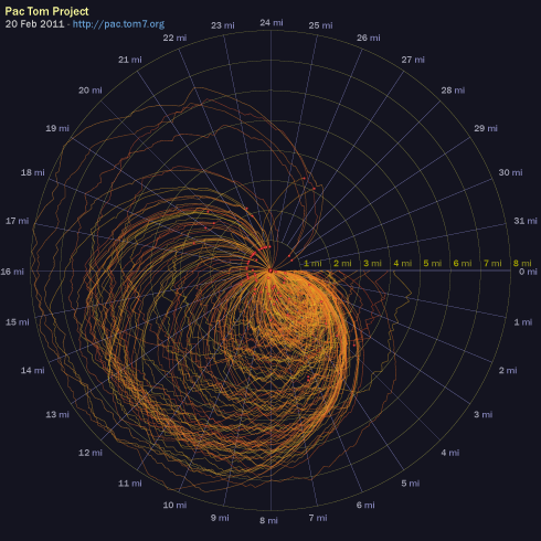
I'd like to think that my data visualization experiments are self-explanatory, but this one does not have the ability to write or talk so I will do the needful. Each one of the orange lines is a Pac Tom running trip (now a slot-jackpotting 222 of them). The squiggles always start at angle 0, corresponding to 0 miles. They proceed around the radar circle clockwise according to how many Tom-sneaker miles the trip is, with a full revolution being 32 miles. At every point their distance from the center is based on the number of crow-flying miles that I am away from my home, with the outermost circle being 8 miles. Red dot emphasizes the end point. I hope that you appreciate the radial and angular gradations because those were fiddly to make in SVG, particularly the labels.
What can we tell from the graphic? Well, most trips start and end at home. This is obvious from The Rules, which require it. You can see that a bunch of them end about the same distance away; these are all me fizzling out at CMU's campus, where water and HVAC are plentiful, or sometimes where I used to leave my junk. You can also see that there's some consistency to the specifics of the routes both at the beginnings and end (like if you look at those 15–20 mile ones that end at CMU, you see the same jog patterns leading up to those ends, which is me taking the same turn on the way back). There's even a more bold orange laser at the beginning, which basically corresponds to me taking any efficient route away from my house, regardless of where I'm going (it is roughly an Archimedian spiral, where after 5 miles of running I'm about 5 miles away from my house). The most interesting thing to me is that there really is a characteristic shape of a Pac Tom run when plotted this way. A typical runner's route (out and back) would be a prolate ellipsis, actually maybe more like a vesica piscis if the runner gets to the summit overlook or no tresspassing sign or whatever and turns right around. My shorter earlydays runs, which are hard to see because they're all bunched up on top of one another in the South-East octant, are kind of like that actually. But the canonical Pac Tom run now is obovate like a ginkgo leaf, where I run away from home then zig-zag back and forth for many miles, creating the tiny leaf teeth at approximately the same distance, then run back home. There's not even any reason why these would have to be leaf-shaped at all; you can see the few Pittsburgh Marathons in there (those count), which are more like abortive Spirographs.
I had appendix surgery (meaning they just cut it out and threw it in the biohazard) in September and then a work crunch that disrupted my running for a while, but I'm now back to it. I'm getting in decent shape again for the marathon, which I am excited about mostly because of the costume plans. I just polished off large distant neighborhoods Sheraden and Elliott (after a fairly heartbreaking trip where I thought I had at great effort finished, but had missed a tiny 50-foot segment, so I had to go many miles out of my way to get that one yesterday, in really OCD-affirming style. Having done that is actually one of the diagnostic criteria in DSM VII.) and the remaining cleanup to do on the South Side is pretty light and much closer to my home. I think I can be done with those with maybe two months of regular running, and maybe even finish the North Side, which is all that's left, by the end of 2011? 4500 miles in 27 days 15 hours of running, so far. You may track my progress via the graphics at the Pac Tom ultimate cybersite.
Pac Tom September update
(12 Sep 2010)
Time for another update on my project to run the length of every street in Pittsburgh, called Pac Tom. It's all about the map:
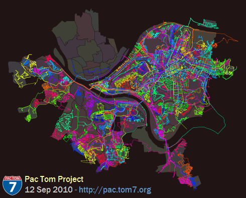
Also available is the same map in PDF so that you can pinch to zoom. Over on the right (known to cartographers as "East") you can see Pac Tom Level 1, totally all done. I've been hard at work on the stuff South of the Monongahela since I finished Level 1 almost two years ago. It's hard because it's far from my house (see rules and regulations) and crazy hilly. You can see that I've made a lot of progress either just by the superbrite color lines all over everything (btw that image above is about 136 square miles, about 140 feet per pixel) which is where I went, or by comparing to last time, or by me being more specific:
Neighborhoods totally done (level 2): Banksville, Beltzhoover, Bon Air, Brookline, Carrick, Chartiers City, East Carnegie, Esplen, Fairywood, Hays, Knoxville, Lincoln Place, Oakwood, Overbrook, Ridgemont, St. Clair, Westwood, Windgap.
Total running events (this includes Pac Tom, training, races, and 3D World Runner): 734
Total time recorded: 25 days, 23:15:38
Total distance: 4230.118 miles
But actually what I really wanted to show you was a newer map, which has been on the Pac Tom site for a while but I have never explained. It's the shortest paths map:
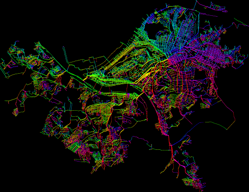
Well, at this view it just looks like the regular map vomited a rainbow all over itself. What's going on is that this is a graph of all of the places I've been (each individual GPS waypoint), connected by heuristics (like they were consecutive in a trip, so I actually ran between them, or they appear to be near enough to imply that I could run between them) and then I compute the shortest path from each point back to my home. Here's a zoom up:
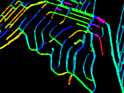
Bonus points if you recognize the neighborhood! See all those fingersnakes reaching up to meet one another? Those aren't dead ends, they're the farthest away from my house I can get on those roads (the leaves in the minimal spanning tree rooted at my house). On one side, the shortest path is to go South, but just a few feet away, the shortest way is to go North. (My house is Southeast from here.) I spent a lot of (fun) time writing this code partly in the hopes that it would teach me about better ways to get out to distant neighborhoods, but it turns out that on city streets (especially grids), the shortest path on foot is usually pretty obvious. Even when it's not, the difference rarely exceeds 100 feet. The most interesting places are probably choke points, like bridges:
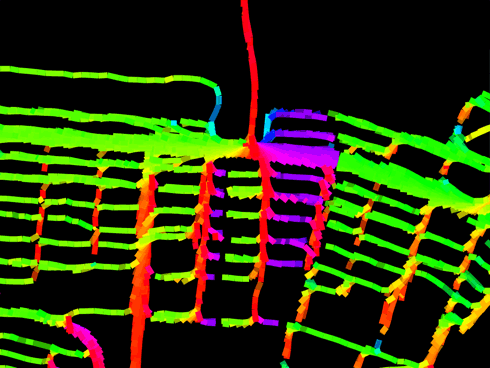
Pretty much everything nearby points up this bridge. The colors by the way are not gratuitous; they indicate the physical heading that I should be running on that segment to decrease my distance to home. Green means East, red means North, violet means West, cyan means South. This is meant to emphasize the break-even points described above. Here you can see from the thickness of the lines (which just comes from having lots of runs through there, with GPS noise) that I don't usually take the Birmingham Bridge, even though it would save me about a South Side block's width (that's the pink stuff: Turn around!) I usually prefer the Hot Metal Bridge to the East because it's got better pedestrian access and also my brain autopilot is accustomed to the area, having run it like a hundred times. Unfortunately it's hard to get route preferences (and other stuff like elevation change) incorporated into the formulas. So, rainbow brite indeed but not actually that useful. The maps are updated automatically after every run onto the graphics page. You can check out the source code which of course is mostly calls out to general-purpose libraries for loading GPS data and computing fine-grained distances on the earth pear's surface and undirected graphs and snapping the neighborhood boundaries to be exactly perfect, and outputting the SVG, all of which I of course wrote myself even though it probably or certainly already exists because have you MET Tom?

Also available is the same map in PDF so that you can pinch to zoom. Over on the right (known to cartographers as "East") you can see Pac Tom Level 1, totally all done. I've been hard at work on the stuff South of the Monongahela since I finished Level 1 almost two years ago. It's hard because it's far from my house (see rules and regulations) and crazy hilly. You can see that I've made a lot of progress either just by the superbrite color lines all over everything (btw that image above is about 136 square miles, about 140 feet per pixel) which is where I went, or by comparing to last time, or by me being more specific:
Neighborhoods totally done (level 2): Banksville, Beltzhoover, Bon Air, Brookline, Carrick, Chartiers City, East Carnegie, Esplen, Fairywood, Hays, Knoxville, Lincoln Place, Oakwood, Overbrook, Ridgemont, St. Clair, Westwood, Windgap.
Total running events (this includes Pac Tom, training, races, and 3D World Runner): 734
Total time recorded: 25 days, 23:15:38
Total distance: 4230.118 miles
But actually what I really wanted to show you was a newer map, which has been on the Pac Tom site for a while but I have never explained. It's the shortest paths map:

Well, at this view it just looks like the regular map vomited a rainbow all over itself. What's going on is that this is a graph of all of the places I've been (each individual GPS waypoint), connected by heuristics (like they were consecutive in a trip, so I actually ran between them, or they appear to be near enough to imply that I could run between them) and then I compute the shortest path from each point back to my home. Here's a zoom up:

Bonus points if you recognize the neighborhood! See all those fingersnakes reaching up to meet one another? Those aren't dead ends, they're the farthest away from my house I can get on those roads (the leaves in the minimal spanning tree rooted at my house). On one side, the shortest path is to go South, but just a few feet away, the shortest way is to go North. (My house is Southeast from here.) I spent a lot of (fun) time writing this code partly in the hopes that it would teach me about better ways to get out to distant neighborhoods, but it turns out that on city streets (especially grids), the shortest path on foot is usually pretty obvious. Even when it's not, the difference rarely exceeds 100 feet. The most interesting places are probably choke points, like bridges:

Pretty much everything nearby points up this bridge. The colors by the way are not gratuitous; they indicate the physical heading that I should be running on that segment to decrease my distance to home. Green means East, red means North, violet means West, cyan means South. This is meant to emphasize the break-even points described above. Here you can see from the thickness of the lines (which just comes from having lots of runs through there, with GPS noise) that I don't usually take the Birmingham Bridge, even though it would save me about a South Side block's width (that's the pink stuff: Turn around!) I usually prefer the Hot Metal Bridge to the East because it's got better pedestrian access and also my brain autopilot is accustomed to the area, having run it like a hundred times. Unfortunately it's hard to get route preferences (and other stuff like elevation change) incorporated into the formulas. So, rainbow brite indeed but not actually that useful. The maps are updated automatically after every run onto the graphics page. You can check out the source code which of course is mostly calls out to general-purpose libraries for loading GPS data and computing fine-grained distances on the earth pear's surface and undirected graphs and snapping the neighborhood boundaries to be exactly perfect, and outputting the SVG, all of which I of course wrote myself even though it probably or certainly already exists because have you MET Tom?

